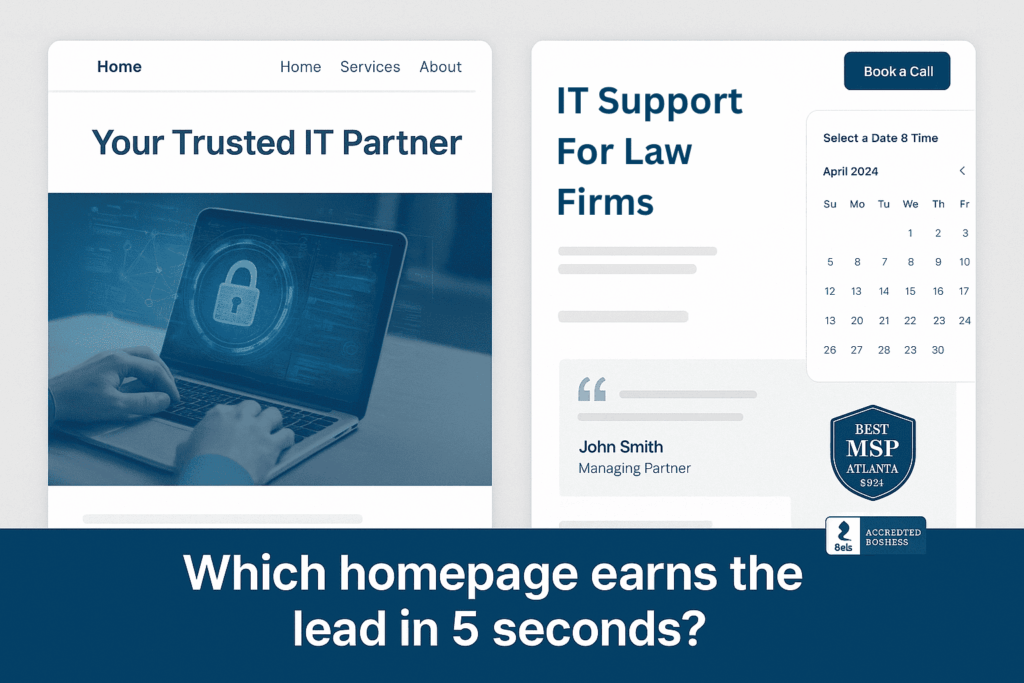
Does Your MSP Homepage Pass the 5-Second Test?

When a visitor lands on your homepage, they make a decision fast: Stay or leave. The difference often comes down to clarity. Can they tell what you do, who you help, and what action to take without scrolling?
Too many managed service provider (MSP) websites waste this critical window with vague headlines, cluttered layouts, and no clear next step.
Let’s fix that.
What Is the 5-Second Test (and Why It Matters)?
The 5-second test is simple: Can a new visitor understand the following in 5 seconds or less?
- What your business does
- Who it serves
- What they should do next (Call? Book a consult? Fill out a form?)
If not, they’ll bounce. It doesn’t matter how great your services are. If your homepage isn’t clear and compelling, you’re losing qualified leads every day.
The Anatomy of a High-Converting MSP Homepage
Here’s the layout we recommend and implement at MSP Hub HQ to help MSPs in Atlanta (and beyond) convert more leads:
1. Clear Hero Section with a Direct Headline
- Headline: Explain what you do and who you do it for.
- Subheadline: Expand with 1-2 benefits or proof points.
- Example:
“IT Support for Atlanta Law Firms That Need Fast, Secure, and Reliable Service.”
2. One Primary Call to Action (Above the Fold)
- Place a direct CTA like:
- “Book a Free IT Assessment”
- “Schedule a 15-Minute Call”
- Include a calendar embed or prominent chat widget.
- Don’t make them scroll to act.
3. Trust-Building Elements
- Client logos or industry badges
- Short testimonial (1-2 lines max)
- Security certifications (especially for HIPAA, FINRA, etc.)
4. Visuals That Reinforce, Not Distract
- Clean, professional imagery (avoid generic stock photos)
- Use photos of your team or local landmarks to connect with Atlanta clients
5. Supporting Sections (As They Scroll)
- Deeper dive into services
- Case studies or industry-specific outcomes
- More testimonials with headshots if possible
- Secondary CTAs throughout
Common Mistakes MSPs Make on Their Homepage
- Weak or vague headlines like “Your Trusted IT Partner”
- Too many CTAs (Get a Quote, Call Now, Learn More, etc.)
- No live chat or easy way to schedule
- No proof that others trust you
- No mention of who you actually serve (niching builds trust fast)
How MSP Hub HQ Helps MSPs Nail Their Homepage
We don’t just design pretty sites. We build conversion-optimized MSP websites that:
- Pass the 5-second test
- Highlight your niche (like legal, accounting, medical)
- Embed real-time booking calendars and chat widgets
- Showcase testimonials and case studies
Everything is done-for-you and tailored to your region and service area.
CTA Block: Want to See the Layout in Action?
Book a Free Homepage Review Let’s look at your site together and compare it to what’s working best right now.
Final Takeaway
Your homepage has one job: convert curiosity into conversation. If it’s not doing that in 5 seconds, it needs work.
Make it clear. Make it trustworthy. Make it easy to act.
Want help? Book a demo and we’ll show you what high-converting MSP sites actually look like.*

